An ongoing dialogue on HIV/AIDS, infectious diseases,
March 31st, 2019
The Problem with Research Posters — and a Bold Approach to Fixing Them
The scientific poster, as envisioned anew by Mike Morrison.
When submitting an abstract to a scientific meeting, you can usually expect one of three outcomes.
I’ve listed them below in order of preference, plus the messages the meeting organizers and abstract reviewers are not-so-subtly sending you:
- Oral Presentation: Congratulations! Your abstract has been accepted for an Oral Presentation — in other words, the work sounds so fascinating, so potentially important, we’d love to hear more. You’ll give a 10-minute slide presentation in front of hundreds (maybe thousands) of colleagues on a big stage, backed by a larger than life video feed of your face on our giant LCD screen — so remember to pluck those errant facial hairs beforehand.
- Research Poster: Congratulations, your study has been accepted as a Research Poster! Now, you must generate a single-slide PowerPoint file packed with text, figures, and bullet points, have it professionally printed as a bed-sheet sized poster, and then affix it to a mobile bulletin board during the conference. We’ll give you a designated time to stand by your poster to explain the results. But don’t be alarmed when hundreds of other researchers and their posters line up as well in a vast, industrially lit space. And when we say vast, we’re not kidding — an Airbus A380 might roll by on its way to the runway.
- Rejection: We’re sorry, your study was too weak and/or uninteresting to meet our high standards. We’ll probably tell you that there were many competitive submissions, which is supposed to make you feel better. But you can come to the meeting anyway, providing you pay the registration and housing fees.
While the oral presentation is clearly the winner here, the research poster is undoubtedly the most challenging — and much more numerous, so everyone has to do one sooner or later. Several reasons why posters fill us with dread:
- How do I know what to include on the poster? More isn’t always better, but that lesson is lost on all of us while preparing posters. The default position? More is more. Many of these posters have so much text that they would exceed word-limits on actual submitted manuscripts, if not Victorian novels.
- How to get noticed? This large poster with tiny text is simply hard to read — personally made worse by the fact that I’m at that stage of eye “health” where everything is either too far away or too close. As a result, most meeting participants experience research posters as a blur of information as they walk by. It doesn’t help that further distractions abound in the poster hall, including chance encounters with colleagues, friends, and the occasional giraffe, elephant or other large mammal. I mentioned that the poster halls were vast, didn’t I?
- What’s the best way to convey the information to the (rare) person who stops by and actually wants to discuss your poster further? Here you need a good “elevator pitch,” but I always feel kind of like the weather person on the news show. “And over here [gesturing], we have both the multivariable analysis and the 7-day forecast. Don’t forget your umbrella for Tuesday!”
- What if you get a bad poster location? Did I convey the vastness of these interior spaces with the above reference to the Airbus A380? To the giraffe/elephant? If you’d prefer another reference, I recall a time my poster was positioned in the back corner of a cavernous hall, so far from everything that I’m convinced Lewis and Clark would have skipped this part of the country as too remote or forbidding for habitation. I stood there a long time, just me and my poster, tumbleweeds rolling by … hello? Can anyone hear me?
- What do you do with the poster after the meeting? Many young researchers wonder how to transport the thing after the meeting, which isn’t exactly airline-friendly in shape. After years of experience, I’ve finally figured it out: Unless you have a specific need for the poster already scheduled, say, “Thank you for your service,” Marie Kondo-style, and toss it in the recycling bin. Problem solved!
Not all is lost with research posters, however — it’s still better than a rejection, much better. After all, some of the most important research starts its academic life as a research poster. In our field, the most notable example is the first case of HIV cure after stem cell transplant. Yep — originally “just” a research poster! Maybe it was the sample size (n=1).
Now, how to fix them. The topic is much on my mind since I stumbled across the work of Mike Morrison, a Ph.D. student in psychology.
After I reached out to him, he was kind enough to share this “short version” of why he tackled the problem:
User Experience (UX) Designer quits career and starts a PhD in Organizational Psychology. Goes insane from how horrifically inefficient the user experience of science is. Has serious health scare. Suddenly gets real motivated to fix the problem and speed up science. Starts with the poster.
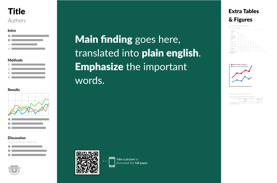
His brave plan for research posters puts the main message right in the center — and BIG! — with supporting information along the side. I’ve embedded the key figure from his method at the top of this post; he generously shares some templates here.
So if you’re a medical or scientific researcher, do yourself a favor and watch the brilliant and entertaining video. I’ve been thinking about it since seeing it last week, and have already shared it with some collaborators — and now with all of you.
And for your next scientific meeting — will you be brave enough to try it?
15 Responses to “The Problem with Research Posters — and a Bold Approach to Fixing Them”

Paul E. Sax, MD
Associate Editor
NEJM Clinician
Biography | Disclosures & Summaries
Learn more about HIV and ID Observations.

 FROM NEJM — Recent Infectious Disease Articles
- Case 21-2026: A 28-Year-Old Man with Headache and Vision Loss in the Right Eye July 23, 2026A 28-year-old man was admitted to the hospital because of monocular vision loss. Examination showed optic disk edema, and imaging revealed liver lesions and lymphadenopathy. A diagnosis was made.
- Klebsiella Brain Abscess and Evolution of Heterovirulence in the Urinary Tract July 23, 2026In a patient with a staghorn calculus, chronic urinary tract infection with Klebsiella pneumoniae enabled within-patient evolution of virulence properties that facilitated dissemination of infection, leading to a brain abscess.
- The Best of Both Worlds — Using Clinical Trial and Observational Data to Evaluate Vaccine Protection July 23, 2026Well-designed observational studies are critical to advancing understanding of the effects of vaccines. But they are often dismissed as lacking the methodologic rigor necessary to inform policymaking.
- Neurocysticercosis July 23, 2026A 52-year-old woman presented with a 4-month history of headache and visual hallucinations. MRI of the brain showed cystic lesions containing bright nodules.
- National Elimination of Hepatitis C — The Case for Starting in Prisons and Jails July 23, 2026The United States could take meaningful steps toward eliminating hepatitis C by broadly testing and treating people who are involved in the criminal legal system.
- Case 21-2026: A 28-Year-Old Man with Headache and Vision Loss in the Right Eye July 23, 2026
Very insightful, interesting and engaging.
I have shared this with my students and colleagues.
Hope to see better posters in next conferences.
GREAT thoughts. I’m going to share with my own residents and with the presenters at our local resident/fellow research forum.
This is brilliant!!! I’m definitely trying this in my next poster!
Thank u 🙂
Also, check out Zen Faulkes’ blog on posters http://betterposters.blogspot.com/
Worth reading for those who present.
Brilliant! Still looking for validation participants? Did you mention that there are available templates? Rodger Kessler
I look forward to seeing this poster design at IDWeek.
My most frequent frustration about posters is presenters who don’t show up. A lot of the value for poster-surfing attendees is the opportunity to discuss a poster with the presenter. It’s very frustrating to spend lots of time picking out interesting-sounding posters in advance, and then find no one there to discuss it when you finally find it in aisle 27. This is not rare at IDWeek. Some conferences won’t let absentee presenters have a poster the following year, which is an effective, if draconian, way to encourage presenters to show up at their own poster.
Great suggestion! In my “world” the normal posters aren’t quite as bad anymore, but there is still room for improvement. However, most of our poster sessions has the posters in portrait format and then your suggested layout will be a bit more difficult to apply, although the principle still holds.
Interesting approaches to improve readability and presentation, and I’m happy to see someone from the UX world trying to tackle this. Members of the patient community who attend CROI and other conferences have been clamoring for lay-language summaries on posters that address the “why is this interesting? what’s the result? how does this move the field forward?” questions for years.
The real questions will be 1) how to improve the poster experience while still meeting poster guidelines set by organizing committees, 2) if my poster is too visually “out there” but still contains great science, will it be more likely to be avoided as attendees walk the hangar bay? [Personal opinion: QR codes are soooo 2010….]
This is a great idea! But coming from the UX world myself, I’m surprised that they decided to put the typical information on a panel on each side of the board. If someone is trying to read information on one side and wants to continue reading, they have to step all the way to the other side of the poster and may end up blocking or having to walk around someone who’s taking a picture of the QR code… Also, If you plan on using this idea, I would suggest not leaving white space at the bottom. Instead, Place mores spacing between topics (i.e. discussion, results, etc.)
Great idea though and and I will definitely be using a tweaked version of this design on my next poster!
Dear Paul – I genuinely love reading your blog, thank you! I am also really smitten with this new poster method—makes so much sense to me and Mike Morrison hit the nail on the head with the challenges we face at scientific conferences (CROI especially)! Key takeaway first – and BOLD! Fun video! 🙂
If I may play devils advocate:
While I agree that poster design should be re-vamped, the idea that the ‘main finding’ should be the focal point of the poster is not what the scientific process is about. In fact, this is what leads to people p-hacking and falsifying data – the idea that significant results are the key to publication. I always try (in vain) to teach trainees that the methods are the most important part of any study. It irks me that some publications print them in smaller fonts. Must we do this with posters as well? Posters are presenting non-peer-reviewed data and are a forum for discussing methodology. Let’s not lose sight of this!
(Love the blog, by the way!)
One poster at ECCMID2019 brave enough: Tom Parks P0637. Works for me.
I politely completely disagree for several reasons
1) A meeting abstract with limitations in word count does not allow for a strict peer review required for manuscript publication as well as the limitations inherent in abstract review process. Therefore, conclusions of abstracts should always be viewed with caution rather than accepted as scientific fact.
2) a major benefit of presenting at a meeting is the opportunity to get feedback from those in the field with insight on your topic (and potential peer reviewers). By presenting data and reviewing this data with the people truly invested in the field allows the investigator to identify novel strategies to enhance your research or consider alternative conclusions. For this insight, you need to present/highlight the data and not focus on your own conclusions.
3) i am a traditionalist so my compromise is to use your title to highlight your conclusion
I think your insight and presentation was spot on…if you can reach more people with something that doesn’t overwhelm the viewer – it is truly an accomplishment. Thanks so much for the great video…will be trying this format on my next poster! 🙂
I found your talk and concept quite interesting, am keen to adopt your template for my poster to be presented this Friday. Could you please share the template of same. Thanks